This article was originally published by me on the Codeburst

Modals are one of the most vital component of UI elements on the web. they provides a solid foundation for creating dialogs, popover etc.
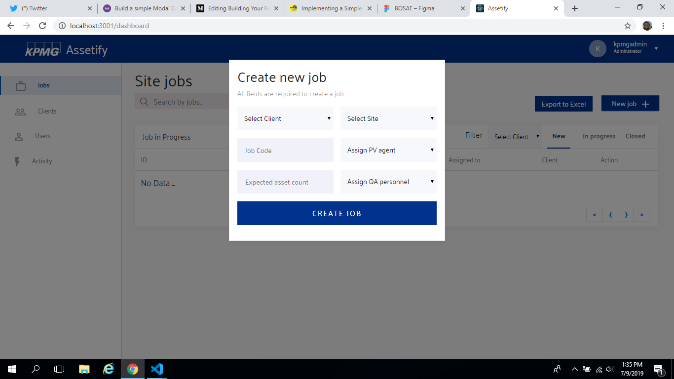
In this article we will see how to build our own modal component in react. Here is the snapshot of how our modal component will look like
Prerequisites
Before getting started, you need to ensure that you have Node install on your machine, and npm package manager, because we will be using it for package management, you can decide to use yarn for the same purpose. We will create the boilerplate code for our React app using the
create - react - app;command-line package. You also need to ensure that it is installed globally on your machine. If you are using
npm >= 5.2;then you may not need to install create-react-app as a global dependency since we can use the npx command.
Getting Started
create new React Application:
Start a new React application using the following command. You can name the application however you desire.
create-react-app react-modal-appThe scaffolding of the project comes with some dependencies to run our project is with the command npm start and then our project can then be viewed at localhost port 3000 by default.
The Modal Component
n our “src ”folder there is a component folder and container folder, the component folder is where all our reusable component will be while our container folder houses our main class component, so in the component directory we create a folder for the modal component. Next create two file in this directory src/components/modal our react component file and style.
src / components / modal / index.js;import React, { Component } from "react";
import { ModalWrapper, ModalBoxSetup, ModalBg } from "../GeneralStyle";
import PropTypes from "prop-types";
/*
visible: boolean,
dismiss: function on click on Close.
*/
export default class ModalSetup extends Component {
static propTypes = {
visible: PropTypes.bool.isRequired,
dismiss: PropTypes.func.isRequired,
};
render() {
const { visible, dismiss, children, client } = this.props;
return (
<React.Fragment>
{visible ? (
<ModalWrapper>
<ModalBoxSetup width={client}>{children} </ModalBoxSetup>
<ModalBg onClick={dismiss} />
</ModalWrapper>
) : null}
</React.Fragment>
);
}
}N.B: I am using styled-component for styling the modal component which is the “generalStyle.js”
import styled from "styled-components";
import { color } from "../color";
export const ModalWrapper = styled.div`
position: fixed;
top: 0;
left: 0;
bottom: 0;
z-index: 1050;
display: flex;
align-items: baseline;
`;
export const ModalBoxSetup = styled.div`
position: absolute;
left: 0;
right: 0;
width: ${props => props.width || "32%"}
overflow:hidden;
padding:16px;
margin: 50px auto;
box-sizing:border-box;
z-index:1;
box-shadow: 0px 4px 8px rgba(0, 0, 0, 0.04);
background:${color.white};
border: 0.5px solid #E8E8E8;
`;
export const ModalBg = styled.div`
width: 100vw;
height: 100vh;
z-index: 0;
background: rgba(0, 0, 0, 0.5);
Explanation of the modal component
The modal component is we have built above is accepting four props which are visible, dismiss, client and children. visible is what makes the component shows or hide, dismiss props helps hide the visibility of the modal, children props is the unique content of the modal while client props is used for our style to determine the width of our modal making it responsive.
Modal usage
Now we need to incorporate our modal component in the dashboard view as seen in our early snapshot.
import React, {Component} from ‘react’;
//the custom modal component
import ModalSetup from "../../components/Modal/ModalSetup";
// modal content for the New job
import AddNewJob from "./_partials/addNewJob";
class Dashboard extends Component {

  state={isModalOpen: false}
handleModalOpen =()=> {
  isModalOpen: !this.state.isModalOpen
}
dismissable =()=> {
  this.setState({
  isModalOpen: false})
}
  render(){
   const {isModalOpen} = this.state;
   let children;
   if(isModalOpen){
      children =(
        <AddNewJob />
      );
    }
return (
       <div>
          <button onClick={this.handleModalOpen}>New Job</button>
          <ModalSetup
             visible={isModalOpen}
             dismiss={this.dissmissable}
             children={children}
          />
       </div>
     );
  }
}
Modal content
Our AddNewJob component is a sub component which is the form grid we can see in the snapshot modal when open
return (
<div>
<h2>Create new job</h2>
<p id="login-title">All fields are required to create a job</p>
<Form>
   <div className="modal-container row">
     <div id="select-wrapper" style={{ marginBottom: '16px' }} >
        <Select
        style={{
        width: “100%”,
        height: “48px”,
        background: “rgba(107,126,172,0.05)”,
        padding: “10px”,
        border: “none”,
        fontSize: “14px”}}
       name='client'
       onChange={e => this.getSelectedClient(e)} >

            <OptionsStyle value="" disabled selected>Select Client
            </OptionsStyle>
            {clientContent}

        </Select>
        </div>
    </div>

<div className="modal-container row">
<InputPassword type="number" placeholder="Expected asset count" name="ExpectedAssetCount" onChange={this.props.handleChange} style={{ border: "none", width: "195px" }}  />
<div id="select-wrapper">
<Select style={{ width: "100%", height: "48px", background: "rgba(107,126,172,0.05)", padding: "10px", border: "none", marginBottom: "16px", fontSize: "14px" }}
name="site" onChange={e => this.getSelectedQA(e)} >

<OptionsStyle value="" disabled selected>Assign QA personnel
</OptionsStyle>
     {QAdata}
</Select>
</div>
</div>
  <ButtonSetup onClick={this.handleNewJob} width="100%">Create job</ButtonSetup>
</Form>
</div>
Conclusion
If followed the procedure vividly we can use the same modal component in other project irrespective of the modal content and size. Congratulations you’ve just created your first reusable component in react.